
Disrupting Modern Dining
Scroll Down
Overview
Challenge
The dining-sphere hasn't evolved as much as everything else. Why after a great meal with friends there is always this awkward moment in the end when splitting the bill? Why are restaurants still bringing a paper check, swiping cards and taking cash? These were some of the questions we needed to design a solution for.
Approach
Under a tight deadline but with full control of the project, the goal was to make Checkplis an application that could enhance the dining experience for users while helping optimize the productivity of restaurants. For that, we built a brand and platform that allow customers to pay, tip and split the check right on their phones. As part of the branding, I tested several concepts with targeted subjects in order to come up with a fun and playful branding that could speak to Millenials.
Role
Lead Designer
Tasks
Branding
Creative Direction
User Interface
User Experience
Wireframing
Prototyping
User Flow
Duration
5 weeks
Status
Branding
The Right Look
The first step was to ingest what does the name of Checkplis made me think of. I started writing down words that represented quickly my thoughts. Several scenarios and images came to mind, so I started searching for pictures that captured what I was visualizing. I saved all the images on Pinterest and then created a mood board in order to have these images quickly organized. It looked something like this...


From the mood board, I noticed that the right hand was usually raised when asking for the bill. With that in mind, an important aspect of the concept was to have it as a first-person point of view for it to represent the user's standpoint. Hence, I decided to take a picture from my angle as a reference.
Defining Through Feedback
Once I had that view in place, I started thinking about how to make it playful and for a younger audience. That sparked the usage of the more iconic and cartoon-ish references from my mood board. I began designing some raw examples and showed it to targeted people, in order to get their feeling and myself a gut-check without wasting too much time conceptualizing. From the feedback, I gathered some key points and continue polishing the idea more and more. I went ahead and showed another round which gave me the answers needed to craft what I thought best represented Checkplis as a brand.

Even though the app was targeted mainly to female millennials, it was important to keep colors gender-friendly and not too feminine. With that in mind, I decided to use a set of colors that resembled a young, playful but sophisticated appeal. I paired the logo with a typeface that could harmonize nicely to create the final brand mark.


Product Design
Picking the Right Pieces
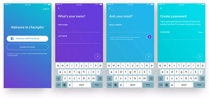
With a brand and tone in place, the final stretch was to design an iOS app that could allow users to pay, tip and split the check themselves. It needed to look clean, practical and simple. I started researching a bunch of apps to get a feeling of what was out there. My goal was to look for key elements that were intuitive and users were widely used to. Most times you don't need to reinvent the wheel. Once I passed the discovery phase, I was ready to design a prototype that we could test, feel and interact with.

Below, some examples of the checkout process. The focus was to allow users to select the items ordered with a click and invite others to join the open tab. When a user invites a friend, the app will send them a push notification to join. Once a user selects their items, they are prompt to a page with their subtotal where the tip can be added based on the experience. Then, you'll be able to make and confirm payment without aking the waitress for the bill. You just pay the tab or splitting the bill on your phone, and get going!

Another feature we wanted to build was the ability to have a feed where you could view what your friends or other people checked-in at the restaurant are saying about the food and overall experience. In a v2, you maybe be able to even ask a question in real-time... but that's something we are still considering.


I'm always striving to help teams create experiences that help improve people’s lives. You can reach me at:
© 2019 NEAU Concepts