
Simplifying Social Sharing
Scroll Down
Overview
Challenge
Every time a campaign is about to launch, teams need to ensure that the message and all corresponding assets are on-brand, proof-read, and ready to go. But, most times we find ourselves under tireless hours of content organization and tiresome back-and-forth communication with advocates to share the right content. And in the end, we are not sure if the right link, picture, or hashtag is being shared. Or, maybe it was at the wrong time :-/
Approach
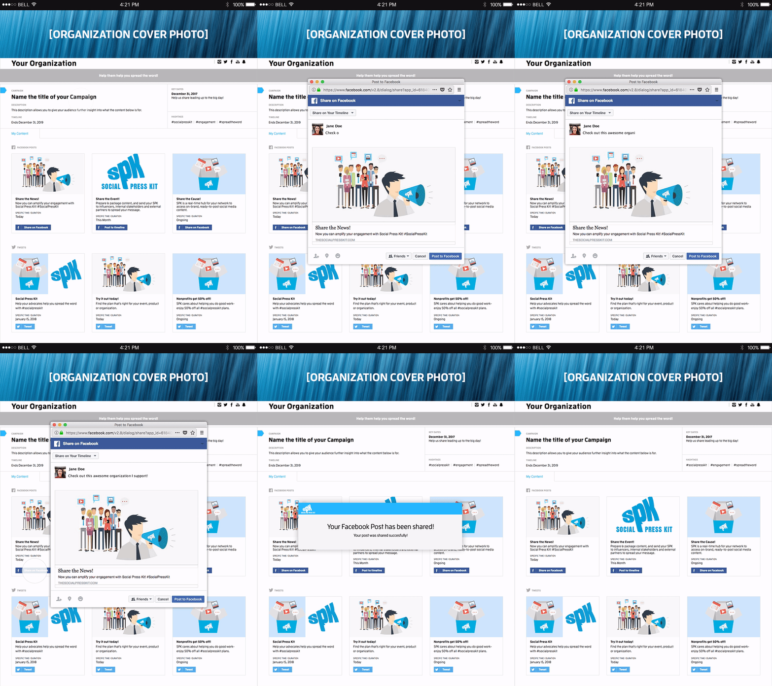
Content is king, but most times it's all over the place. Amplifying the engagement with advocates to spread the right narrative to their audience was the main goal. We created a SaaS product that could serve as a simple real-time hub for a network to access on-brand, ready-to-post social content. Being a full team project, I took responsibility for creating the brand, a comprehensive website and a user-centered interface for clients to take care of their campaigns with ease.
Role
Lead Designer
Tasks
Branding
Creative Direction
User Interface
User Experience
Prototyping
Usability Testing
Duration
8 weeks
Status
Branding
How Reach Looks
In the beginning, it was challenging to understand the actual idea. I was working at the Brand Knew agency and all we had were feedback notes from the experiences of the marketing department on how to improve the communication with our clients for the next campaign. To start, we sat down with a few colleagues to brainstorm. I heard the different cases and suggestions on how we could optimize their production time with clients. It had to be a tool that could serve as a funnel, and help optimize communication in all aspects. In order to get a feeling of what this product should represent, I dove into the Google sea in search of everything that represented communication. I went through numerous images scrolling through the results. Once I saw a megaphone, I started to envision it. It represented a funnel where communication was being amplified for a broader reach... With that in mind, then it came down to "how we make it ours?"


Product Design
Research Leads to Concept
Like I mentioned before, in the beginning, the whole idea itself was very abstract. We knew what overall function we wanted, but it was still in baby steps. All we had was constructive feedback from our daily experiences working at the agency. To start, we build a quick MVP with minimal design effort, in order to have a functional platform we could test and scratch ideas with selected clients. After beta testing it, we felt it was ready to actually design it from all the feedback gathered. It gave us a clearer path on what to prioritize and the type of functionality critically needed to be built.


Interactive Bits of Information
The importance of having a clear online narrative was crucial. We all remembered how tricky it was to understand the concept when explained for the first time. We had to ensure visitors were able to digest easily how the product works through different bits of information and get interested in subscribing to it while browsing the site. In order to facilitate the digestive process, we built a microsite showcasing how simple it was to ensure on-brand, ready-to-post social content when launching a campaign. We included an informative video, the ability to toggle between the dashboard views and some interactive client demos to really get a feel of the product.


I'm always striving to help teams create experiences that help improve people’s lives. You can reach me at:
© 2019 NEAU Concepts
